Tel:
+52 22 72 714 121
Inicio
Nosotros
Quiénes somos
Galería
FAQ
Cabañas
Restaurante
Aventura
Pesca
Parque
Contacto
Aventura
Home
Blog
Galería
Aventura
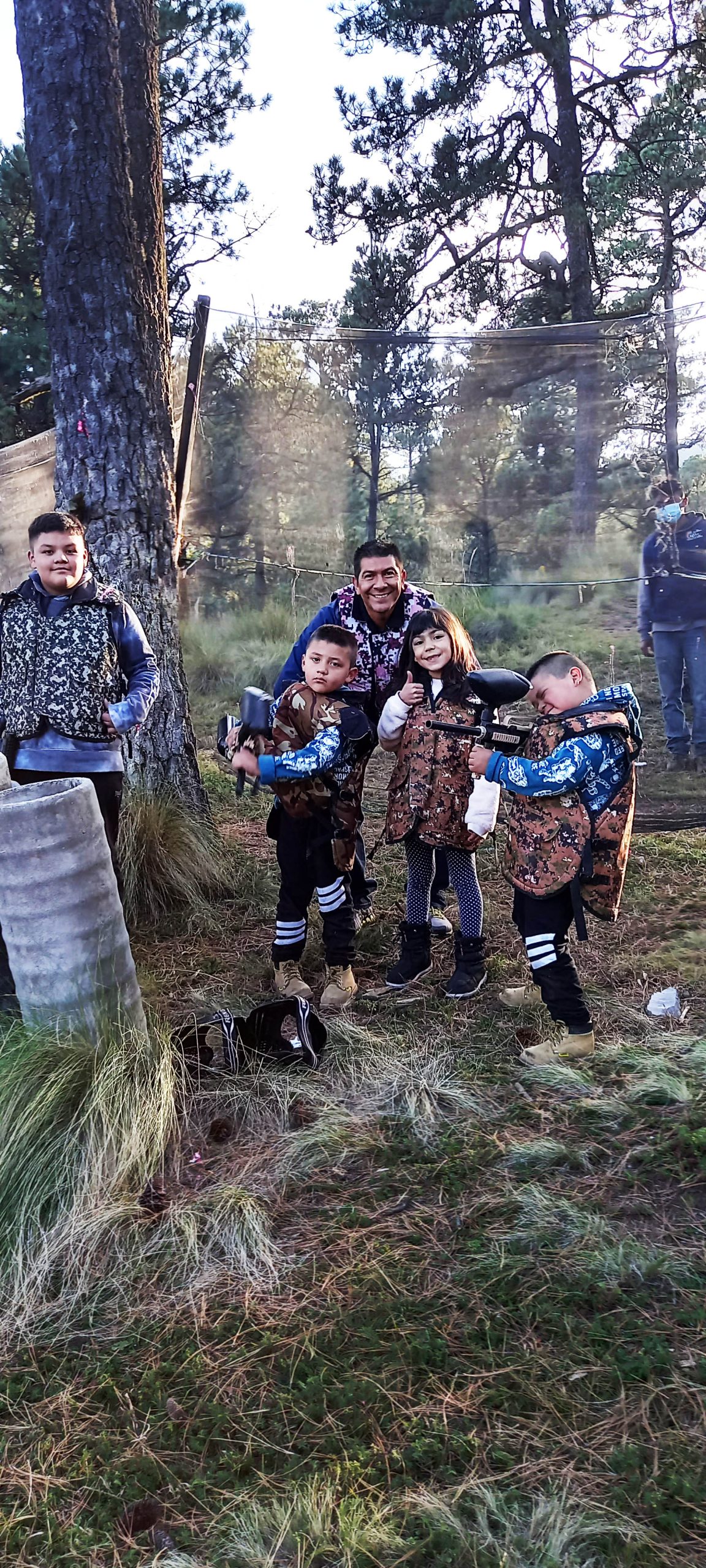
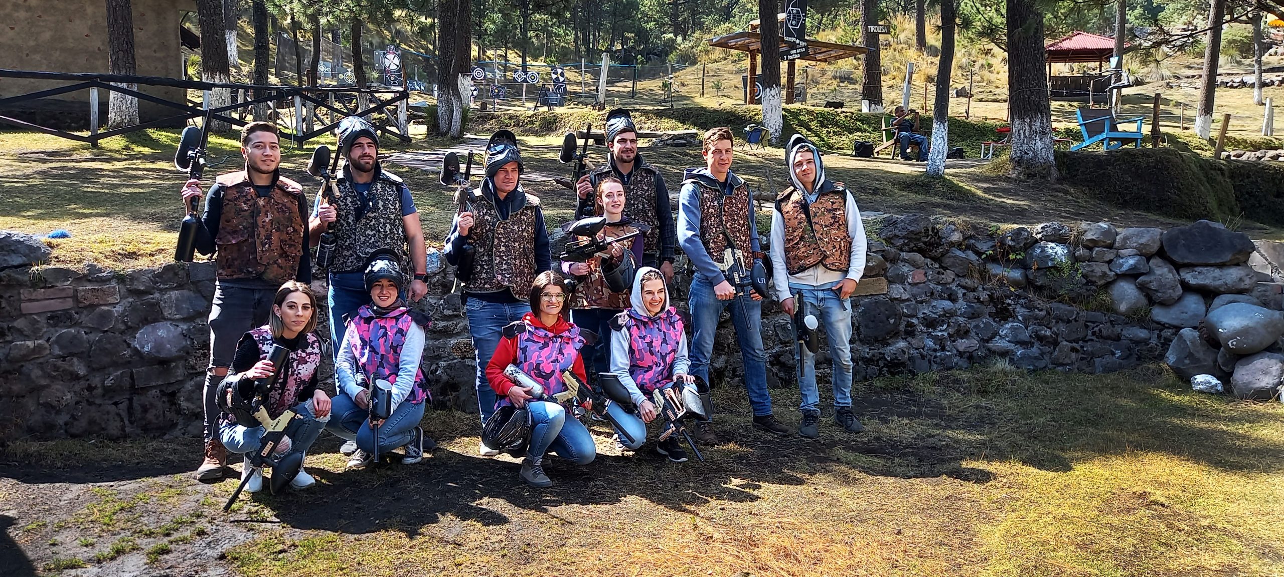
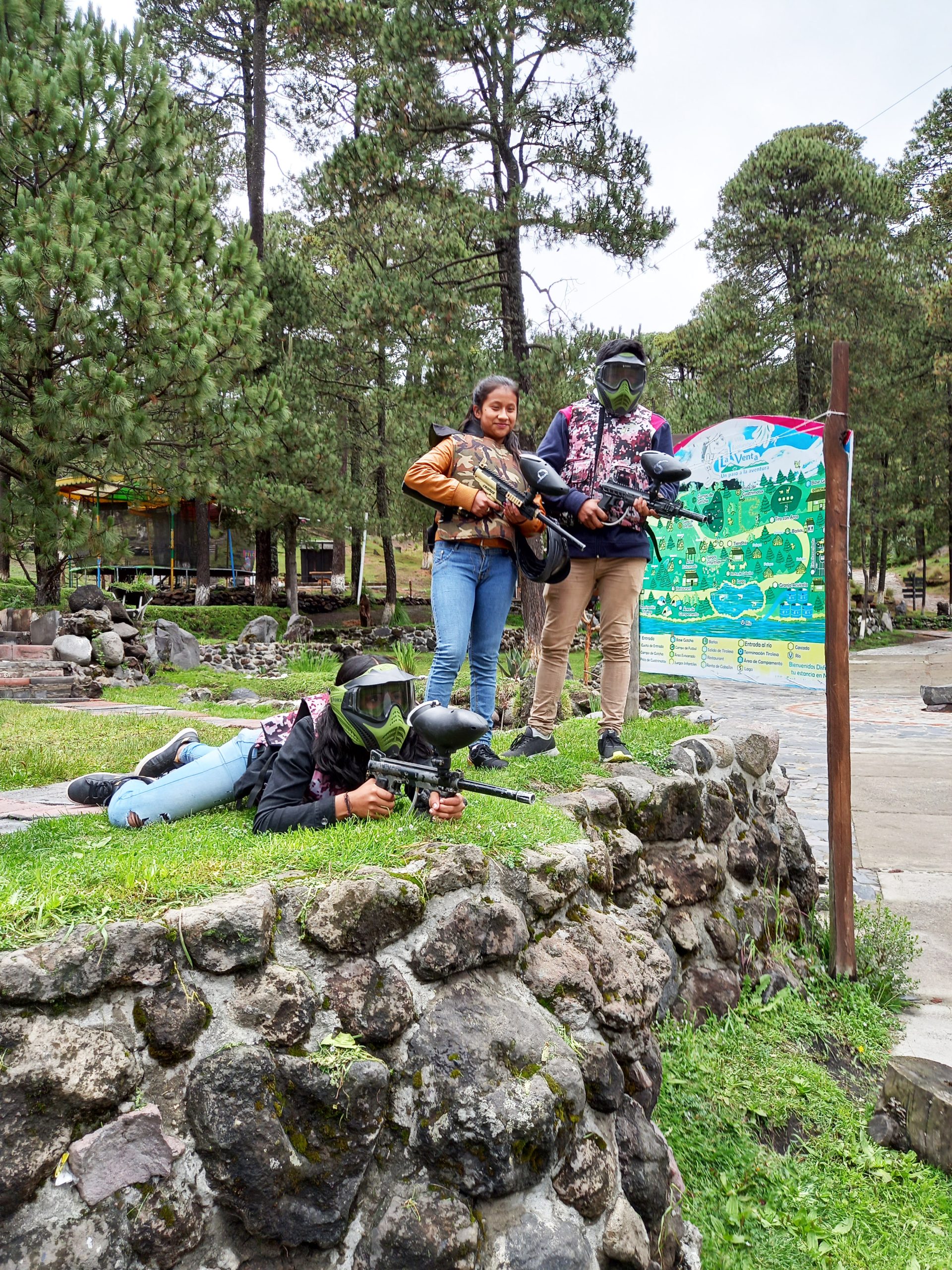
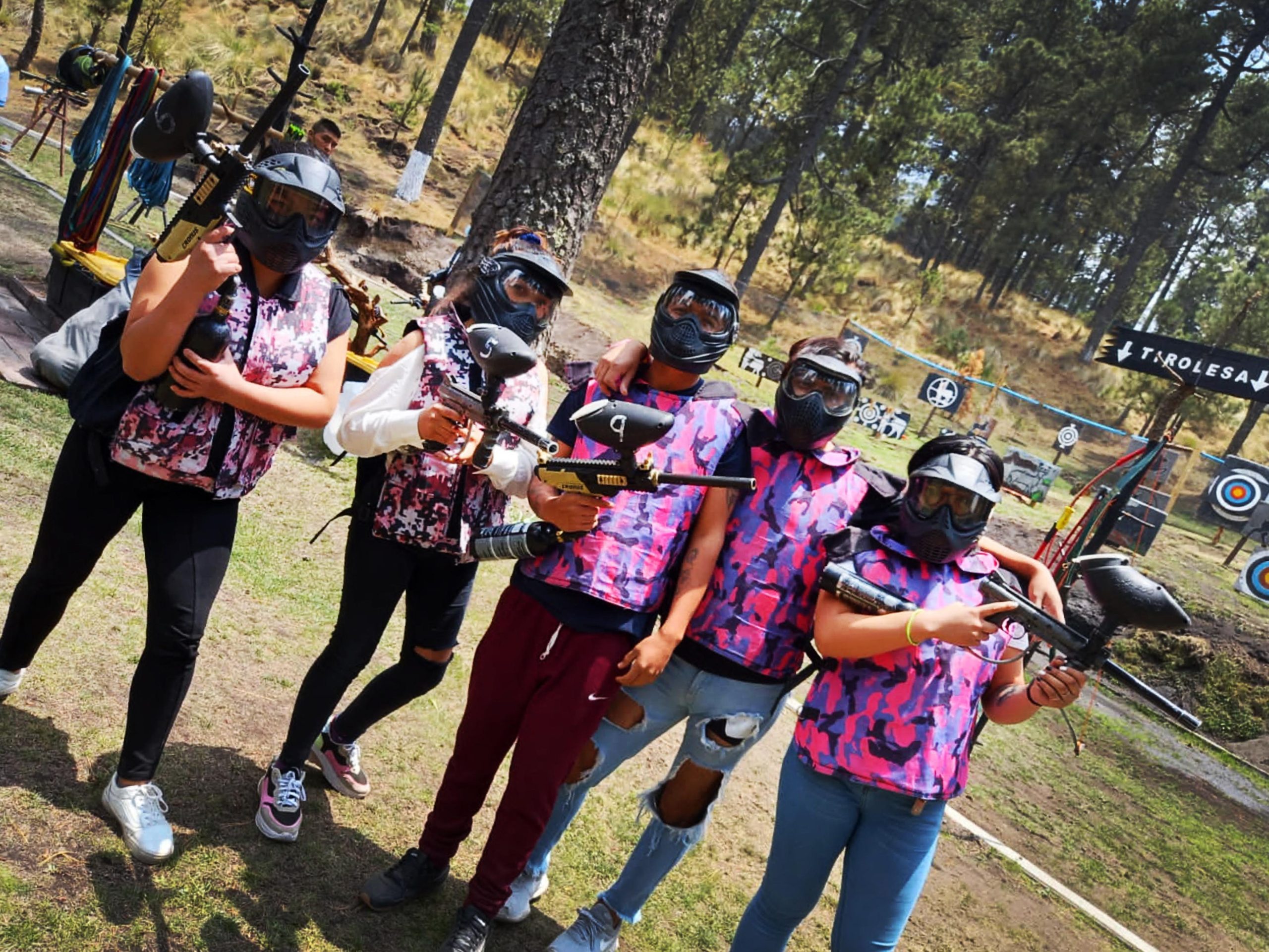
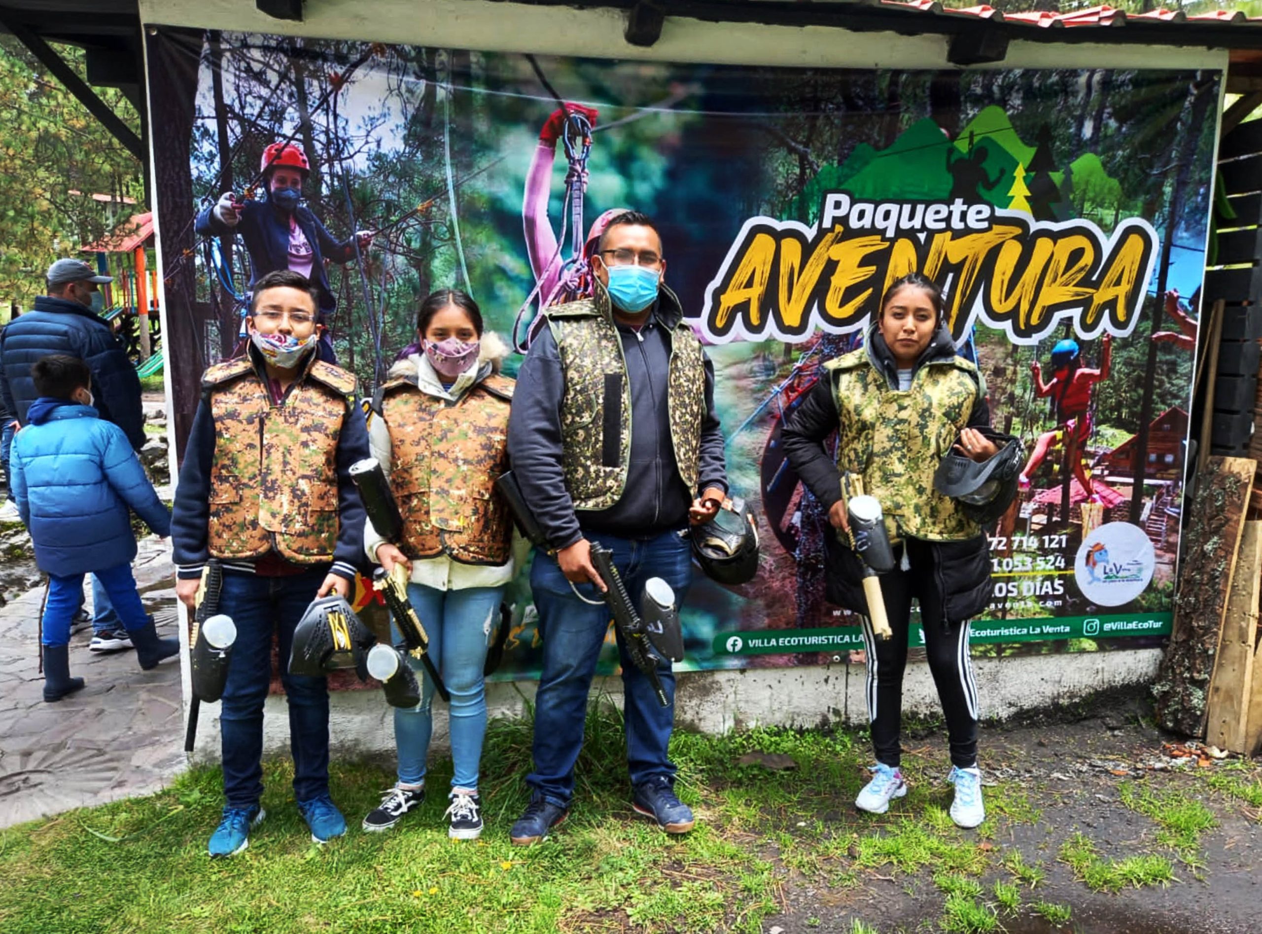
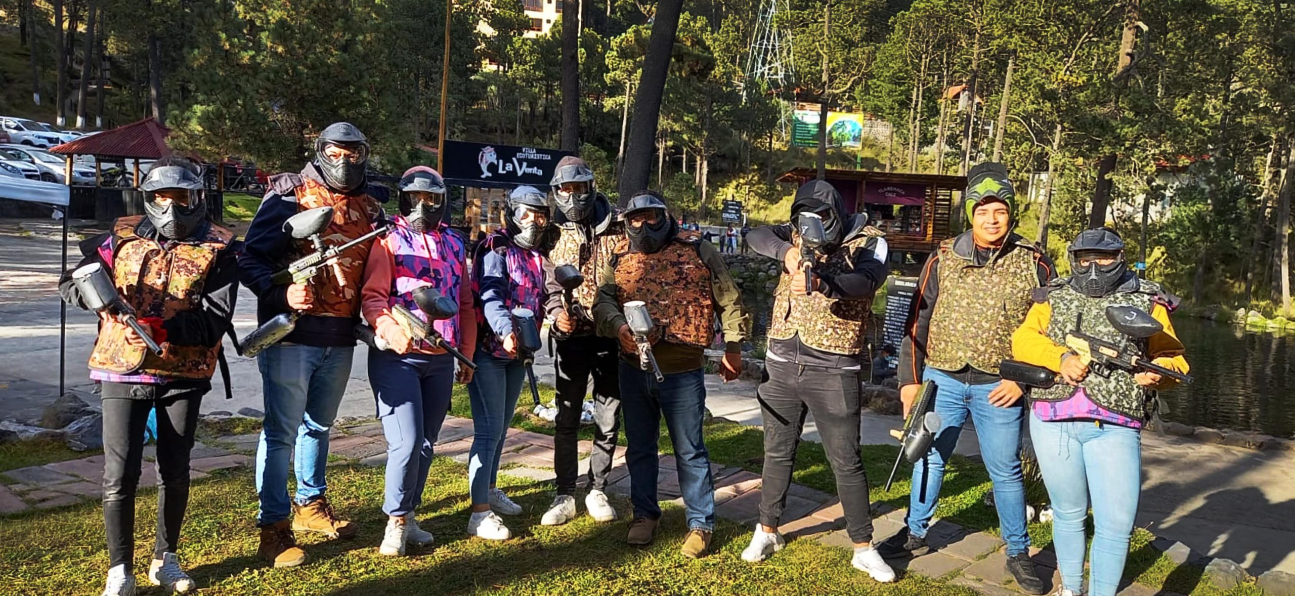
Gotcha
14
Dic
Gotcha
Post by
admin
WhatsApp
Hola 👋, bienvenido a
Villa Ecoturística La Venta
¿Podemos ayudarte?
Abrir chat
Powered by
Joinchat